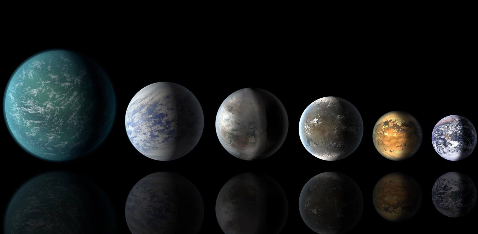
Exoplanets are mysterious, they’re complicated, they’re important, they’re awe-inspiring. And, to a team of artists at the Jet Propulsion Lab, they’re also totally fun.
They’re a topic for endless artistic creation because they’re that remarkable combination of brand new and, surprisingly, comfortably familiar. Exoplanets may be weird and wild but they’re also potentially home to life and, well, people. And what better way to describe and talk about exoplanets than in a context we all understand — as a travel destination where one of us just might some day spend some time.
Thus was born the series of exoplanet posters — created by artists of JPL’s imaginary Exoplanet Travel Bureau — that have caught the imagination of millions. When the JPL team put highest quality copies of their posters onto their Planet Quest website in summer, the traffic was so great that the site crashed.

(NASA/JPL-Caltech)
We know that JPL is extraordinary when it comes to designing, building and then operating satellites and rovers, but extraordinary in art, too?
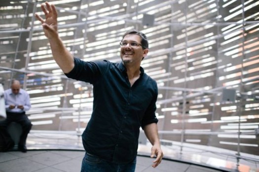
“We had this idea — we wanted to say something real about these planets, something based on firm scientific discoveries, but we also wanted it to be approachable and appealing,” said David Delgado, one of the three members of the JPL art team called “The Studio” which designed and produced the now iconic posters. He has a background in teaching (at JPL), in graphic communications and, initially, in advertising.
“Each poster would have one planet, and we would illustrate one strange or wonderful aspect of it. It kind of caught on.”
While the idea of creating some exo-posters had been bouncing around for some time in the minds of three of the members of the JPL art team — Delgado, Joby Harris and Daniel Goods — it was a specific event and specific need that brought them to life.
Last year, MIT exoplanet pioneer Sara Seager was coming to JPL, and the exoplanet office wanted something special to greet her. So it was a perfect moment to finally execute the exo-poster plan. Three posters were created, one showing a super-Earth with low gravity, one a planet orbiting a pair of binary stars, and one where the nature of the sun’s radiation might produce vegetation of a different color than on Earth (if any vegetation existed, that is.)

“They were supposed to be seen in hallway, just to kind of decorate the area for a welcome,” said Harris, the primary illustrator. “It was really dark, so we had to figure out lighter colors to use and maybe a different kind of style.”
“Little did we know how it would take off. People were stopping to look at the posters and figure them out, interns were taking pictures, summer students were flocking in,” he said. “Pretty soon people were asking for copies and our office said, sure, let’s make copies.”
So those copies were released early this year and, because they are NASA products, they were all free. News of the posters was soon all over Twitter and Reddit and JPL’s Planet Quest site (http://planetquest.jpl.nasa.gov/exoplanet_travel_bureau) came crashing down.
For first recipient Seager, her hallway introduction to the posters was a delightful “wow” moment: “In exoplanets, so many things that happen surprise us by exceeding anything we could have imagined. Usually that sentiment is for new exponent discoveries, but in this case its for the how iconic the posters have become, and the public reaction to them.” She has copies hanging in her home, in her office and uses them in her public talks.
None of the particular planets selected is considered habitable by the experts, but all had a human visitor included nonetheless. And that’s how the seemingly visceral connection with viewers was made. Looking back, Delgado sees the inclusion of people as essential.
“There were some objections for sure to having people in the posters. It seemed to be communicating that NASA was going to these places with astronauts, and clearly it is not,” Delgado said. “But people want to place themselves on these planets, to be a viewer who experiences what it might be like. As a way to get folks excited about exoplanets and learn, seems fine to me.”
Clearly, the look, the artistry of the posters was a driving force, too Many illustrations of celestial bodies come with a kind of classic sci-fi imagination that emphasizes drama, collisions, sharp lined realism and bright colors. The Travel Bureau posters are a polar opposite — retro and at times Art Deco. Some have pointed out that they look a tad like Amtrak’s travel posters or the work of a few artists experimenting in science fiction, but there’s no doubting that their work was novel.

It was illustrator Harris who brought that sensibility to the project. He has a background in special effects, graphics and film– where he was exposed to the art deco look. He also works in television; one of his early projects was to design some of the props for what became the cult science fiction series “Firefly.”
The poster’s retro look came from a desire to meld nostalgia and the past with the cutting edge future — a return to travel posters of the 20s and 30s, but with rather different destinations.
“We were aiming for a retro-futuristic look, something that brings science fiction into the everyday present,” Delgado said. “It’s like we’re living in the future, or science fiction is coming to life.”
The look has indeed spawned much competition from private artists, who have created planetary and exoplanetary posters in a similar vein. Delgado thinks that many are just fine, but a little limited. “Everyone loves the look. But some capture the fun without the truth of the science.”

“Visual Strategist” Daniel Goods was the artistic director for the project, and he was the one who came up with the idea of adding a line of text highlighting the science. Goods, like the others, has also created substantial art and sculpture installations around the JPL campus, some of which tour the nation and the world and have won awards. The posters, for instance, are now on display at a major art exhibition in Stockholm.
Goods is a native of Alaska with little science background, who grew up in Oregon and Seattle somehow now shines in L.A. He and the others say they thrive on asking questions of the scientists and integrating their knowledge into “The Studio’s” work.
The posters took particular outreach and study to get the right scientific message:
“Where Your Shadow Always has Company” for a planet orbiting a set of binary stars.
“Where the Nightlife Never Ends” for an orphan planet no longer orbiting a sun.

“Experience the Gravity of HD 40307d for a super-Earth where the force of gravity would be much stronger than on Earth.
“Where the Grass is Always Redder on the Other Side” for a planet orbiting a sun cooler than ours and emitting radiation in redder wavelengths.
Given the huge success of the posters, the logical question to ask is whether more are coming, and when.
I certainly asked the question but those who know said they couldn’t answer.
Nonetheless, I think there’s reason to be optimistic that more clever and compelling planetary and exoplanetary art will be coming out of the JPL “Studio” in the months and years ahead. And some will no doubt be retro.
So stay tuned.

